Tony
What to do with all this Data?
Rose
|
Tony |
What to do with all this Data? |
Rose |
|
|
|
|
While Rose was sitting quietly on a bench under a covered grove, reading the New York Times, along came Tony with a stock of paper in his hands and a worried look on his face.
Tony: "Rose, I have all this data and I don't know where to start organizing and making sense of it at all!"
Rose: "I am sure if we can do just that there may be some useful or meaningful information in all that data, for the process of describing and summarizing data is called descriptive statistics and from the summarized data you may draw conclusions or make some statement or judgment about it; this is inferential statistics."
Tony: "So where do I start?"
Rose:
"First
you need to know what type of data
you have and then group or categorize your data or information into
causes and
effects. Those set of data that influence the characteristics you are
measuring
or studying are called independent
variables (cause) and those that show the effect of the
independent
variable are called dependent
variable "
| Example since your data is about the relationship of student's SAT scores on their freshman GPA, SAT scores is the independent variable and GPA is the dependent variable since GPA is dependent on SAT scores. (GPA - Grade Point Average) |
"Based on the definitions of discrete and continuous data; what type of data is GPA?"
Tony: "Since GPA can be any value including decimals between say 1 and 4, for example 3.12 or 1.27, its is continuous."
Rose:
"There
are several things you can do with this data, let me show you with
several
examples."
(narrator - what Rose showed Tony is summarized
in the table below):
| Things to do with data | Why and How? | Examples of Outcome |
| You can use a picture such as a graph to summarize your data. | When data are group into meaningful ways it offers a visual overview of large number of data. Try these interactive programs. | Histograms, Bar Charts, Box and Whiskers Plots, Line Charts etc. |
| You can use a statistics to show some central tendency, a point or value where most of the data seems to cluster around. | This allows us to use one number that represents a typical data value or characteristic. Try these interactive programs. | Mean, Median, Mode. |
| You can use a statistics or parameter to show some range of values or dispersion or distribution over which the data is spread. | This gives us a feel for the range of values over which the data exist. Try these interactive programs. | Range, Variance, Standard Deviation |
| You can order data or group data and find percent of each group relative to all the groups. Say men and women - if there are 40 men and 60 women, then the percent of women is 60% or the proportion is 0.60. | This allow us to use percentiles and proportional statistics to examine data groups or categories relative to each other. | Percentile, Proportions |
There are 4 ways to interact
with
these programs: (For Example):
If you don't know what these things mean the programs will auto detect
and run or not run depending on
your computer meeting the minimum requirements.
note: Only blue
data should be changed in programs and in
some cases you may need to delete unused rows.
| Ways to Interact with Programs / Worksheets | Minimum Requirements |
| (1) If you have Internet Explorer and Windows 2000, you may work with programs by just changing or adding values from your data on the web and the program will automatically change to calculate or display the graphs or statistics you desire. (This approach is often slow and each time you have to go online to solve your problems). | Internet Explorer 4.01 and later and Windows 2000
|
| (2) If you have Excel installed on your computer, you may download by clicking on the Excel link and then choose to Open Program in Excel or Save Excel Programs to open later (This is recommended since you can save programs in a directory with a naming convention known to you and later use by modifying - if you corrupt the program you can always download as many time as needed) | Internet Explorer or Netscape 6.0 or later and Excel
|
| (3) You may use worksheets to systematically work through solutions (this is rarely done except in academic environment since most people use computers to simplify routine difficult tasks). | Just Internet Access |
| (4) You may use specialized Interactive Web Programs created by others and tested by me; however, I cannot guarantee their permanency or ability to work under all conditions required for this course). | Java enabled on your computer. |
Tony: "So all I have to do is decide what type of data I have, organize or categorize it to show frequency for each categories, label each category and then decide what or how I want to show summary information about my data, either in graphic form or with some statistics such as the mean or variance?"
Rose: "Now see if you can use the programs for this descriptive statistics to tell me the sample size, mean, median, mode, range, variance, 75 percentile, 80 percentile and standard deviation of the following data:"
(a) 12, 13, 14, 12, 23, 34, 12, 34, 32, 43, 23, 12, 14, 13, 14, 15, 20, 17 (use the basic statistics program to do so)
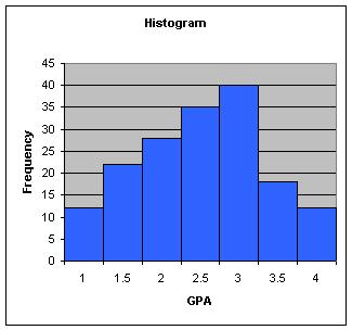
(b) For the categorized data with midpoints shown,
find
the weighted mean and variance for the following sample distribution
and
use a histogram to display the data:
(use the weighted
mean program)
| Midpoint of GPA | Frequency |
| 1.0 | 12 |
| 1.5 | 22 |
| 2.0 | 28 |
| 2.5 | 35 |
| 3.0 | 40 |
| 3.5 | 18 |
| 4.0 | 12 |
Tony: "Here is what I get using the programs"
(a) 12, 13,
14,
12, 23, 34, 12, 34, 32, 43,
23,
12, 14, 13, 14, 15, 20, 17
| sample size | 18 |
| mean | 19.7778 |
| median | 14.5 |
| mode | 12 |
| range | 30 |
| variance | 90.183 |
| 75 percentile | 23 |
| 80 percentile | 28.4 |
| standard deviation | 9.4965 |
(b) weighted mean is 2.7069
and grouped variance is 0.4708
(note weighted mean is the average GPA - continuous scale).
A Histogram from the graph
program is:
 |